+ Freelance Project
+ Information Architecture
+ WordPress
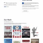
+ Website Redesign
+ Analytics
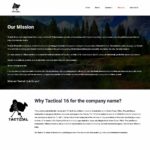
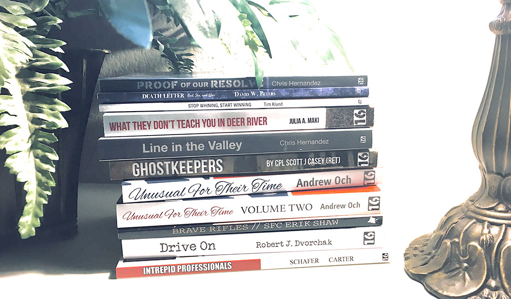
Tactical 16, LLC is a small, veteran-owned publishing company that helps to design, format, and publish the extraordinary stories of ordinary people and everyday heroes.
I am active with Tactical 16, as both a web designer and graphic designer. I took on this site redesign project in early 2018 and it is an ever-evolving work in progress.
CHALLENGE/PROBLEM
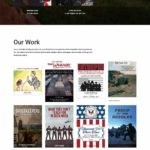
Tactical16.com is a resource for authors interested in pursuing publication of their work as well as a centralized access point for the Tactical 16 audience to find the comprehensive library of books that have been published. As such, information and products need to be easy to find.
The site suffered from a lack of clarity and structure. For instance, book detail pages were not linked to the biographies of the authors who wrote them, the links to purchase the books were not intuitive, and it was difficult to navigate between product pages or to view all of the books available. Additionally, information for potential authors was buried, and not easy to locate.
As a result, the overall bounce rate for the website was 73.44%, and the average session duration was 00:01:08, indicative of an issue with users leaving very quickly and not finding what they needed.
The purpose of this project was to restructure the information architecture and to revamp the website's interface design with the goal of improving the usability of the site so that users could easily find the information they are looking, using page views, bounce rate, and session duration as the key performance indicators.
APPROACH
Information Architecture
The first step in this process was to develop a sitemap to structure my vision for what content would be presented, how that content would be organized into pages and to establish an overall hierarchy of information.
All of the books published by Tactical 16 needed to have their own pages, and it was most logical to group these together under a "books" primary navigation item. "About" and "Contact" needed visibility in the global navigation as well as a section to highlight Tactical 16's sponsors.
The information about the Tactical 16 writing program and a section dedicated to all of Tactical 16's media (photos, videos, podcasts, etc.) are still forthcoming, but the new navigation design is scalable to accommodate the extended content.

Design
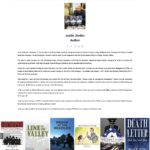
Wireframes were roughly sketched out to plan the layout of the template for the book product pages and the home page. The primary goal of the book product pages was to consolidate information from the old site and have the book information, buttons/links to purchase, and the author biography on one page. This would greatly reduce the number of pages to be built and maintained, and keep related information together in a logical manner.
The next step in this project was to search for a WordPress theme that fit the needs of the site. WordPress had been used previously, and the decision to continue using WordPress was made to keep it fairly simple for everyone in the organization to add or update content. The Avada theme was chosen for its high degree of customization and extensibility. Using this theme, the style guide was established for all UI elements - colors, typography, buttons, and navigation.
Build
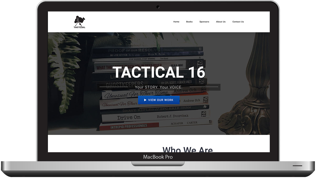
I built the site with the wireframe sketches as a guide. Some changes to the original ideas were made for aesthetic purposes and to accommodate variations in content provided by the Tactical 16 authors.
Testing
Not yet completed
Usability studies are planned to identify any potential areas of confusion or friction in the user experience of the redesigned website UI or information architecture.
The plan is to recruit three testers matching the demographics of Tactical 16’s target audience to participate. According to Facebook demographic information, 82% of Tactical 16's Facebook fans are male, and 60% of that group are between the ages of 25 and 54.
To start the usability testing, these users will be asked to look at the homepage for 5-seconds and relay their first impressions of the site - its purpose and what elements they remembered or stood out to them in that short period of time. Then, users will be asked to complete four common tasks of typical website visitors while verbalizing their thoughts along the way. The four common tasks will be:
- Locate information about the company
- Locate a book of interest and attempt to purchase
- Find information about how to work with Tactical 16 to publish a book
- Contact Tactical 16
RESULTS
Google Analytics
| Pageviews | Unique Pageviews |
Avg Time on Page |
Bounce Rate | Exit Rate | |
|---|---|---|---|---|---|
| Old Book Pages | 398 | 376 | 00:00:26 | 62.65% | 45.36% |
| New Book Pages | 806 | 725 | 00:00:58 | 81.11% | 21.46% |
| Improvement | +107.5% | +92.8% | +55.17% | +29.46% | -52.68% |
| Old Homepage | 790 | 617 | 00:01:12 | 66.55% | 57.97% |
| New Homepage | 1444 | 1113 | 00:01:25 | 57.80% | 55.33% |
| Improvement | +82.78% | +80.39% | +18.39% | -13.15% | -4.56% |
| Old Site Design | 2671 | 2323 | 00:00:50 | 73.44% | 42.57% |
| New Site Design | 3337 | 2758 | 00:01:14 | 64.21% | 45.13% |
| Improvement | +24.93% | +18.73% | +48.61% | -12.57% | 6.02% |
