+ Team Project
+ Responsive Web Design
+ Usability Testing
+ Conversion Rate Optimization
Compassion International is a child-advocacy ministry that works to release children from spiritual, economic, social, and physical poverty through its child development sponsorship program.
My role in this project was as a UX lead - working with stakeholders and developers to gather and define functional requirements and process flows, making sure that all business needs were considered and accounted for. I also designed the cart interface, developed and implemented the testing strategy, and worked closely with the Principal Developer during the IT build-out phase.

CHALLENGE/PROBLEM
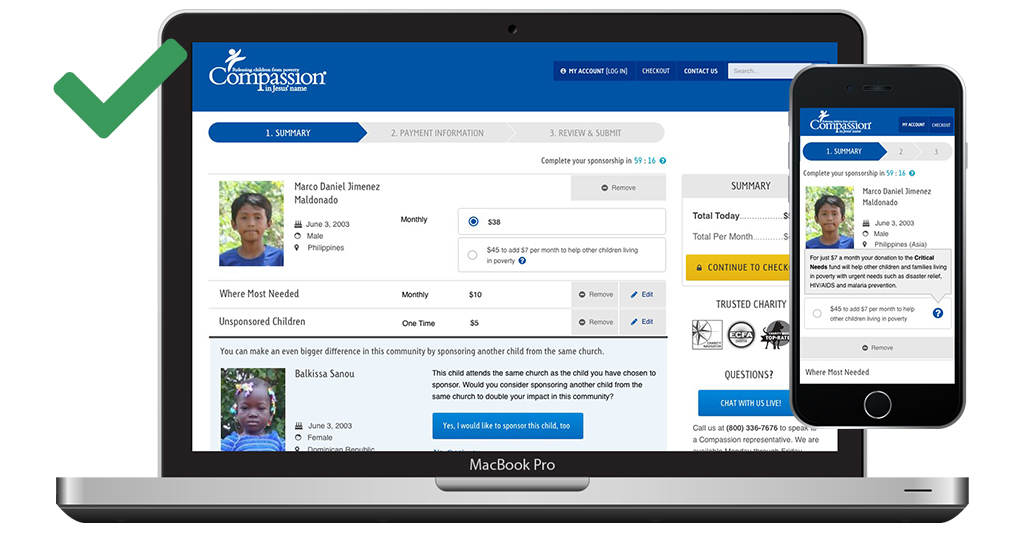
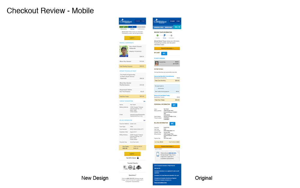
Improve the user experience of the checkout process while also redesigning the cart to work responsively across devices.
- Over 40% of the overall website traffic is from mobile devices
- Measuring rates of completion from the first step of the checkout to the last step of the checkout:
- The conversion rate of the mobile cart was 66.91%
- The conversion rate was 88.38% on desktop devices
APPROACH
To the extent possible, this project followed a design thinking approach.

Usability Audit
Our team commissioned the renowned Baymard Institute to complete a comprehensive usability audit of compassion.com, including mobile and desktop platforms. This provided an objective analysis of usability issues impacting the website as a whole, but for the purposes of this project, I was focused on their recommendations regarding checkout.

Wireframes & Design Comps
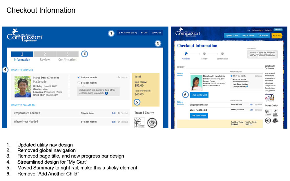
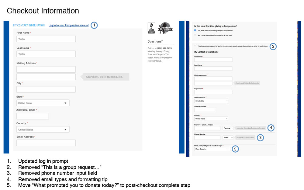
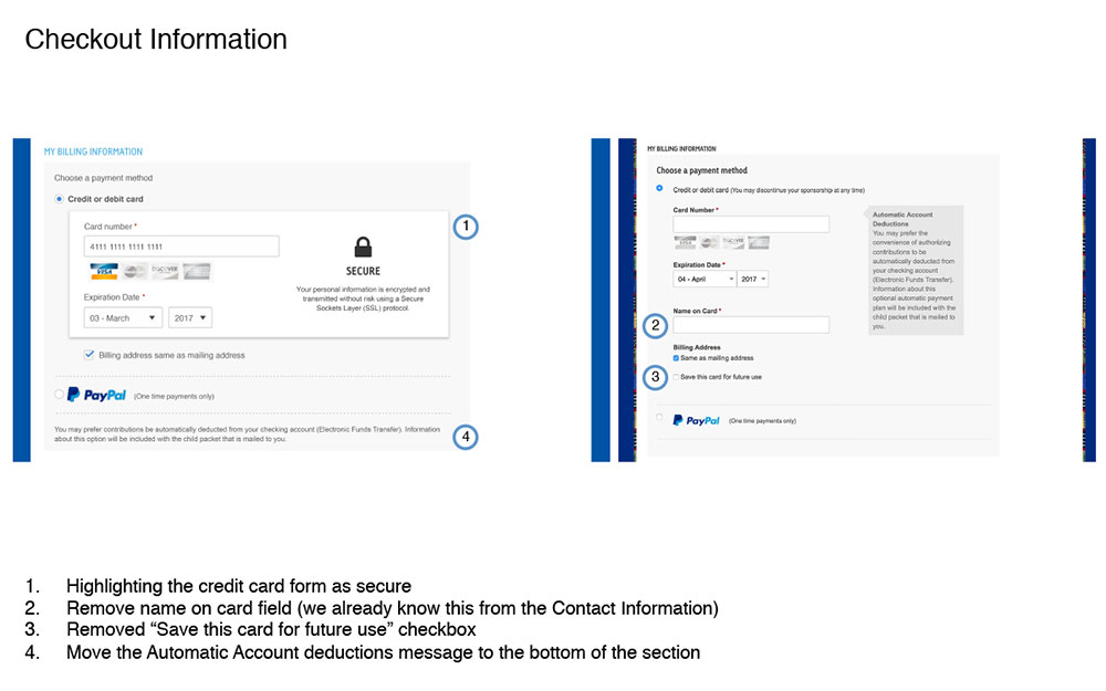
Based on Baymard’s findings, I incorporated the suggestions for improvement into the wireframes for a new responsive checkout using Sketch. I started with wireframes that were the “ideal” checkout flow - greatly reducing the number of required form fields and making the flow as streamlined as possible. This gave me a goal to strive for, and I built a case for the proposed changes to the checkout design and flow and advocated for these changes to stakeholders.
The wireframes were refined and revised as I met with various stakeholders, finding that some of the changes that were proposed were not possible due to business needs or limitations with backend systems and processes.
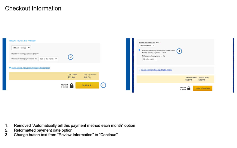
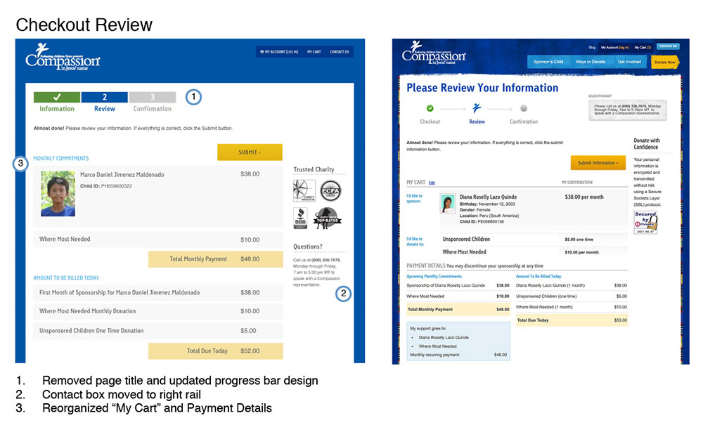
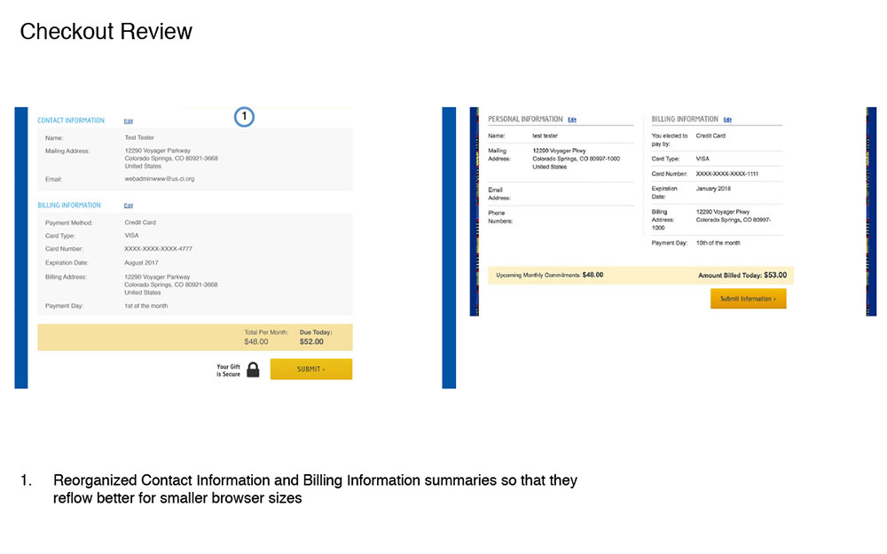
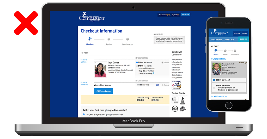
New designs were presented to stakeholders. The changes were annotated and shown side-by-side with the original cart for easy comparison.

Prototype
Working with a developer on my team, a prototype of the checkout was quickly built out using HTML/CSS and javascript on a dev server. The prototype was interactive and as “real-world” as we could make it, without having it tied into our backend systems. This allowed us to bring the experience and interactions to life. This revealed some problems with the way I had originally designed some elements, and I was able to make some more modifications and tweaks to the design and interactivity of the form.

Usability Testing
To make sure the design could be tested on a variety of devices and by a diverse group of users, 5 users on desktop devices and 4 users on mobile devices were recruited for remote user testing on TryMyUI.com; users were requested based on demographics that closely aligned with the demographics of Compassion’s sponsor/donor base.
The test tasks asked users to edit donation amounts within the cart and then complete a transaction. There were a few issues uncovered during testing, so I considered this a successful endeavor because it provided good feedback and direction for design iteration.

Revisions & Iteration
Based on the feedback from the user testing sessions, revisions were made to the checkout designs.

Build
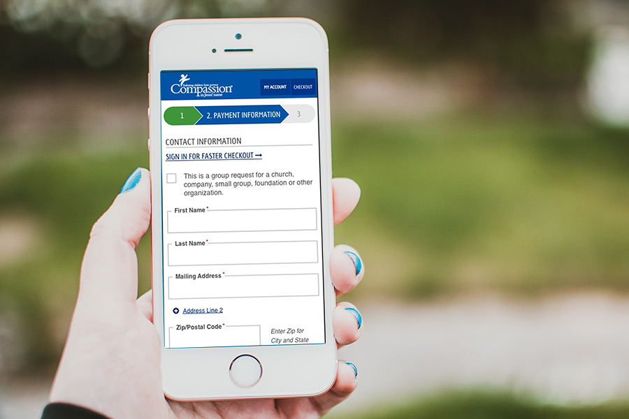
The checkout designs were handed off to IT, and throughout the build phase I worked closely with the Principal Developer to answer any questions that arose in regards to expected functionality, interaction, and provide additional designs for any scenarios that needed to be accounted for.

A/B Testing
We didn’t want to replace the original checkout process without testing the new designs again. I hypothesized that the new checkout design would be a usability improvement and, at the very least, the new responsive cart would have been considered a success if it did not result in a lower conversion rate than the original.
Using Optimizely, I set up and launched the experiment to test the effectiveness of the new responsive cart design against the original cart, measuring overall conversion rates (reaching the checkout complete page with any type of transaction - payments, sponsorships, gifts, and donations), sponsorship conversions (reaching the checkout with a sponsorship), and overall revenue.
RESULTS
| Sponsorship Conversions | Overall Conversions | |||||
|---|---|---|---|---|---|---|
| Version | All Devices | Desktop | Mobile | All Devices | Desktop | Mobile |
| Original | 4.22% | 4.51% | 3.74% | 77.28% | 85.17% | 64.21% |
| Responsive | 5.40% | 5.51% | 5.22% | 78.58% | 85.82% | 66.28% |
| Improvement | +28.01% | +22.1% | +39.58% | +1.68% | +0.76% | +3.23% |
| Statistical Significance | 95.1% | 80.2% | 84.6% | 73.3% | 39.6% | 65.7% |
Unfortunately, the Optimizely test was only able to run for a few days before it had to be stopped due to technical issues discovered on the legacy mobile checkout that was potentially preventing users from being able to complete their transactions. However, after only running for a few days, the new responsive design showed an improvement in child sponsorship conversion rate, general conversion rate (all products, including gifts and payments), and in overall revenue (not including payments or gifts) across devices.
The only metric that reached a statistical validity was child sponsorship conversions, with a 28% improvement over the original and a 95% statistical significance. When segmented by device, the responsive version continued to show an improvement over the original on both desktop and mobile, but we did not have enough traffic to show a valid result, though both segments were above 80% statistically significant which indicates a strong likelihood that it would have validated given more time.
The revenue metric reported by Optimizely showed a 38% improvement overall, across devices, with the largest lift coming from the desktop segment at 39% improvement over the original checkout. Again, these improvements were not able to be validated due to the length of time we were able to run the test.
It was disappointing that I was not able to run the test longer to validate our preliminary results with a larger sample size, but based on the information that was collected, I felt confident that the new responsive design is an improvement over the original.
SUCCESS
